Notes from the 2015 Quantified Self Conference

IMG_20150618_084256
The 2015 QS conference was at Herbst Pavillion / Cowell Theater right on Pier 2 in San Francisco.

If you can’t measure it, you can’t improve it. – Peter Drucker

A few years ago I was introduced to a growing subculture in the U.S. that was really interested in numerically measuring a variety of aspects of their lives like steps, sleep, environmental conditions around where they lived, etc. and attempted to draw correlations from this data to improve some aspect of their lives. This was before the current explosion of fitness devices and collecting this data was a lot more difficult, and yet these individuals went through enormous effort often wearing clunky self-made devices to get access to the numbers they were looking for. The behavior seemed, at least by conventional definitions, not normal.
 
Today, at least a part of this behavior has seeped into conventional user behavior with the rise of measuring devices like Fitbit, smart watches etc and the constant running of ads emphasizing the importance of people tracking their own fitness. But the QS community continues to break new ground in identifying interesting metrics about themselves and finding creative ways to collect them.
 
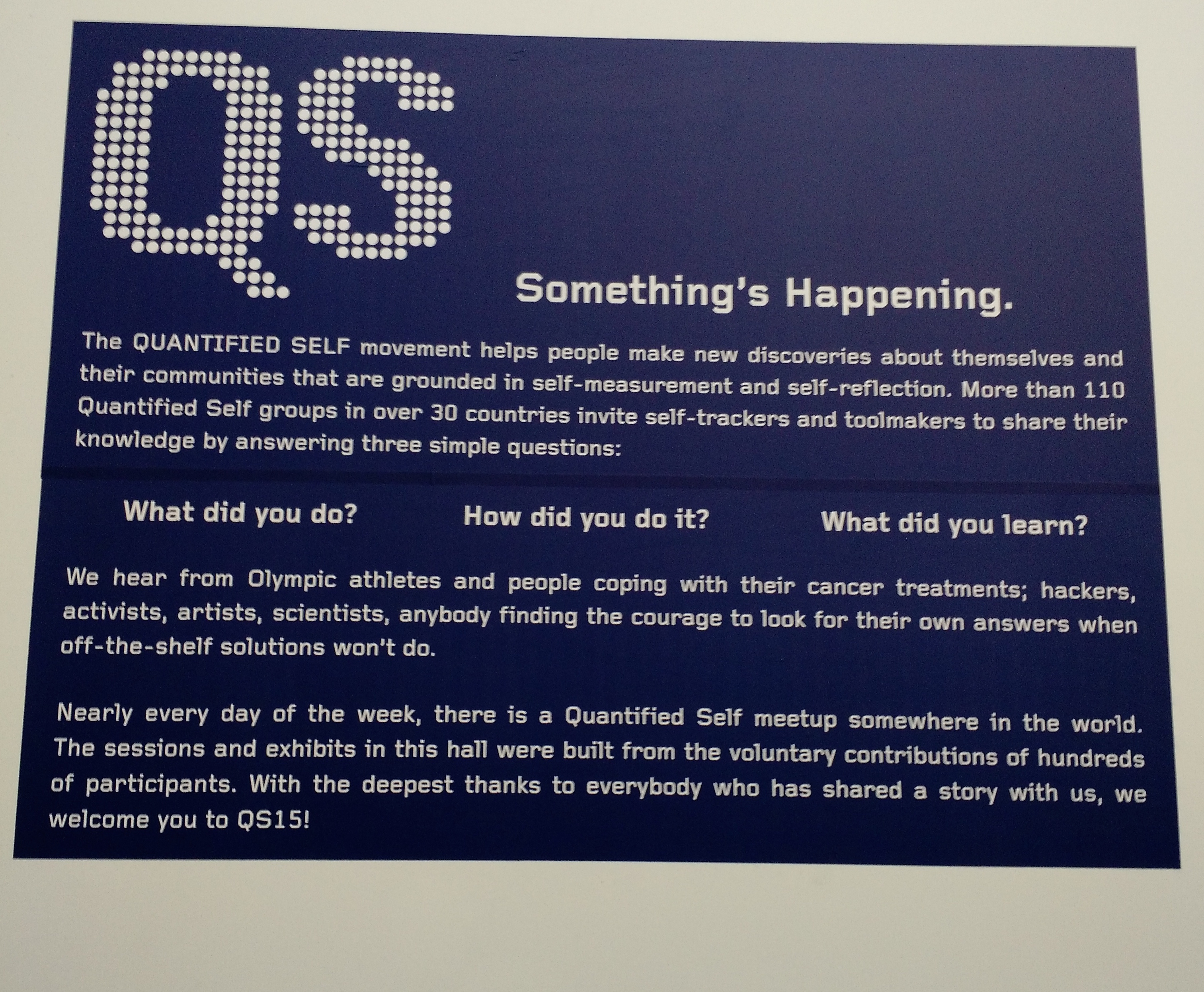
A couple of weeks ago, the QS community had their annual conference in San Francisco and I was fortunate to be able to attend it as Comcast Labs, the group I work for, was one of the primary sponsors.
 
Motivations
IMG_20150618_084123
The QS community is an interesting group of people that come together around their common interest of measuring personal data. I had assumed that it would be predominantly be full of technologists or statisticians, but I met people from a variety of backgrounds from artists to models to fitness instructors.
 
I feel I met 3 types of people there:
  • People doing it for pure curiosity, like measuring time spent on couches or watching TV, cataloging their travels or seeing if chat history could show when they fell in love with their now significant other.
  • People who were trying to deal with real or potential health issues like building apps to collect data to quantify effects of both disease and medication on their bodies
  • People who were using their their own data for artistic interpretations or visualization
 
The Data:
What was interesting was the sheer number of data points people were tracking. A lot of this data used to require medical grade equipment to measure but now can be measured with fair accuracy using off the shelf devices.
These included
  • Heart Rate Variability
  • EDA: electrodermal activity, also known as EDR or GSR, galvanic skin response
  • BMI
  • Blood pressure
  • Fat percentage
  • Macro Nutrients intake
  • Sugar intake
  • Hydration
  • Resting Metabolic Rate
  • Resting Heart Rate
  • Anaerobic threshold:
  • VO2Max
  • METs
  • EEG
  • Breathing patterns
 
Not all metrics were biological. There were also examples of people tracking environmental and social metrics that could influence their lives like:
  • Electric and magnetic fields in their environment
  • Expenses
  • Email volume and how it related to their stress levels
Questions and Answers
Getting data is only one part of the equation. The real challenge is to correlate this data to draw insights. There were a number of talks around people drawing such correlations which were interesting cause a few missed that old adage about correlation not being causation (Did you hear the joke about data proving pirates causing global warming? Cause if you plot the rise of piracy and global temperatures on a graph, they correlate pretty closely). The other challenging aspect is the whole Heisenberg Principle about the very act of measuring something changing what you are measuring.
 
Even so, the speakers at the event had some really interesting talks on a trying to answer a lot of questions via data, such as:
  • How does exercise affect metrics like blood pressure or mood?
  • How do different diets influence mood, health or different ailments?
  • How does zapping your head with controlled electric current affect your brain?
  • How does stress affect heart rate variability?
  • How much does it cost to eat healthy?
  • How happens to your expenses if you don’t have a place to live for a year?
You can see their entire lineup of talks here.
 
Most of the community uses Google spreadsheets to analyze their data, though there was also a talk by a developer at Tableau software about how he used that to analyze his data. But the community is small enough that right now there aren’t enough general purpose statistics oriented tools built for them. At this point just getting data in a non proprietary format like CSV is a challenge (most fitness related services like Fitbit, Google Fit or HealthKit offer their data via APIs but only a fraction of the audience here were software engineers). Other software tools like Beeminder, Zenobase, Gyroscope, Compass  RescueTime were also interesting to see. New wearables like Spire for tracking breathing patterns also piqued my interest but having acquired one, I feel like a second wearable is just one (heh, maybe even two) too many.
spire-feature
Spire is a wearable that clips around your waist and tracks your breathing patterns and guides you towards a more calm breathing pattern
 
In conclusion
The QS conference was quite an experience, specially since I wasn’t that aware of all the stuff happening there and everything felt new. While a lot of it felt a little “out there”, it was the same feeling I got 3 years ago when I first heard about these guys tracking their steps and hours of sleep. It’ll be interesting to see how much of this data measurement becomes commonplace in the coming years.

A better SXSW scheduling experience

I am currently at SXSW, my forth trip to the event. As conferences go, I find SXSW pretty enjoyable and always come back with a couple of new ideas that I can play with. However, as much as I like the event, trying to manage your schedule on the SXSW app itself is pretty annoying.

2015-03-11 18.50.39
At the top of the app as it exists currently, all days are listed in a horizontally scrollable tabs. Clicking on a particular day lists the events for that day in a vertical list, which is typical for apps of this kind of application (though the SXSW app does make it additionally worse by not even adding sectional headers marking the division between different time slots). You can star individual sessions and view them in a separate “My Events” section of the app.
  • Its hard to quickly glance how your schedule is across time slots. Even the My Events section of the app doesn’t group your events by time.
  • Location is a big factor when choosing my events. I often choose an event I might be less interested than another one if it is closer to where I am
Given my irritations, I did a quick web app for SXSW by scraping their schedules. Here is how my app looks like:
sxsw-web
sxsw-web
Because the switching the day of the event is not so important, the app lets you do that using a drop down chooser thats placed on the header of the app. This leaves the horizontal axis to break the day out in terms of time slots. Within each time slot, the events are grouped by location. Adding an event as a favorite moves it to the top and changes the background color so that you can quickly scan events you have marked as interesting really quickly. At this moment, these events are saved locally on the browser’s localStorage space and do not sync across devices.
The app was a quick experiment and of course needs a lot more improvement like global filters by event type and location, cross device save, etc. There are also some HTML glitches that I need to fix, like the whole page scrolling slightly within the viewport in the mobile experience. The code is all on Github if you’d like to add those features or fix bugs.
As always, thoughts and opinions are welcome.

UI Concept: Using Android’s Soft Keys for Screen Pinning

I have written before on how Android could be using their software navigation buttons more appropriately. Seeing how Android 5.0 and 5.1 handle screen pinning seems another one of those situations where it could leverage that capability.

For those unaware of the feature, Android 5.0 introduced a feature that allowed you to pin a certain application to the home screen. The primary use case for this feature is to prevent a child or some one you hand over your phone to to accidentally exit an app that you want them to see/use. Since the feature doesn’t require a pin number to exit the app, the feature is not so much designed for security but rather for preventing accidents. Exiting the pinned app requires you to tap the “Back” and the “Overview” screen at the same time. A feature that people may forget (though the OS does bring up a message if you do tap any of the navigation buttons when a screen is pinned). This is probably what prompted a more explicit how-to view explaining the exit action in Android 5.1.

However this feature once again doesn’t take into account the Android soft keys. When a screen is pinned, why not change the graphics for Back and Overview to pin icons. This would also reinforce the fact that the phone is in a separate “pinned screen” mode.

screen-pin

As always, thoughts are welcome 🙂

WhatsApp Web App and the Rise of Remote User Interfaces

For the last couple of years I have been using WhatsApp to keep in touch with my friends and family in India. While it doesn’t seem to be very popular in the US, its amazing to see how almost everyone I know in India is on it. However till this week, it remained solely a mobile app, which is fine in the whole “think mobile first” world, but does get annoying when you are sitting in front of a PC and still have to dig out your phone to respond to a message (or talk into your Android Wear Watch 😉 )

However as I started reading up on it, it turned out to be a pretty bizarre web app. I read a message by the CEO of WhatsApp claiming Apple tech did not offer them the right hooks for their implementation (basically apps running in the background and some unique feature of Android push notifications)

It turns out that actually the “web app” was just a visual shell with the messages being sent back and forth by the phone app itself, something easy to verify by just putting your phone in Airplane mode which brings up this notification on the app:

Screen Shot 2015-01-22 at 1.45.27 PM

The other interesting bit of titbit is why the app was Chrome only. What chrome-only tech was WhatsApp relying on? The answer, after a bit of googling, turned out to be Chrome Push Notifications. Basically, it seems like their architecture is very similar to apps like MightyText or PushBullet that have started to bridge the Android phone and desktop Chrome experience.

Its a pretty interesting implementation. One theory on why WhatsApp decided to go with this implementation is that it might have something to do with their encryption system and rather than re-implement that on the browser in JavaScript, its just easier to send that message via the phone, if you can get that message to the phone locally from the browser. Making the desktop UI just a dumb presentation layer could have a lot of advantages by reducing the number of clients you have to support.

It almost seems that we are now starting to move towards a world of Remote UIs: apps running on the one machine (usually your phone) but pushing the interfaces to another device that may be more contextually appropriate. Some other examples of this include:

  • The Apple Watch and CarPlay both run apps that do all the compute on the phone and present the visuals on to the watch or car’s dashboard display
  • The Android Wear / Android Auto requires a little more computational capacity on the remote display, in both cases they need to be running Android as well with only data moving back and forth. But the core idea remains the same.

While a few folks are crying foul about this implementation, I am kind of a fan. Besides the lack of multiple code bases for desktop and mobile, this setup restricts the number of devices you are signed in to. Since your phone is the one channel back to the servers, it lets you authenticate at one place and just use the most appropriate screen around.

It’ll be interesting to see if more apps adopt this architecture. Its unusual but seems pretty cool. It also might be the beginning’s of Android’s answer to iOS’s Continuity feature.

Thoughts on Swift

For the last 5 months, I have been working on an iOS project using Swift. Its been an interesting experience. While the language has some parts I like, personally I feel mostly disappointed at the complexity of the language cause, honestly, I don’t see how they help me write apps faster.

A friend of mine described Swift as a “Mirror Programming Language”: everyone who looks at it sees what he wants to see, which I find pretty true. I have had JavaScript developers see it very similar to JavaScript, Scala devs see it like Scala, Ruby devs see it like Ruby etc etc. To be fair, Swift probably took elements from all of the above, but its still interesting to hear the conversation.

My Hopes for Swift

I attended WWDC this year and was there during the Keynote when Apple announced Swift.The moment they showed a swift program with variables defined with the “var” keyword, I got really excited. I am actually a fan of JavaScript, which I generally recommend as a first language to learn for folks trying to get into programming (My only gripe has been lack of a formal definition for “Classes” which seems to be coming in ECMAScript 6). Additionally, Apple introduced “Playgrounds”, an interactive workspace very inspired by Bret Victor’s work as seen in the video below. Bret Victor is another of my heroes, one of the few developers who questions why programming today is still stuck in the text-and-compiler metaphor that was invented over 40 years ago. If you haven’t already, do watch the video below where he goes through some of his thinking.

But between a js-like syntax and an interactive playful workspace, I thought Apple had finally cracked it and democratized programming. On the flight back, I was so sure that Swift would be the programming language that I would now recommend to students going forward.

Working with Swift

Working in Swift the last few months, my opinion has changed a lot. The simplicity that (I thought) Swift promised never really happened and I find the language a lot more laborious to work with than even Objective-C which I generally liked.

  • Optionals?: Swift introduced Optionals that let you explicitly declare that certain variables may not hold data at all times. I am not sure what kind of bugs this is helping me avoid. And I am tired of unwrapping Optionals all over my code. Additionally, Optionals introduce a whole new slew of potential errors.
  • Type casting in Swift sucks. Swift does nothing automatically. Want to add an Int to a CGFloat? Well make sure the you convert your Int to a CGFloat yourself. This gets very annoying when you want to do things like manipulate view dimensions by multiplying with and adding/subtracting constants. I have reached a point where I only do one simple math operation per line.
  • Unexpected types: Why the hell does array[1..10] return a Splice object that you have to cast to an Array?!  If I am asking for a part of a collection, just return it as the same data type.
  • Way too much: There is a lot of smart in Swift, and I am sure it attracts a certain kind of personality. Operator Overloading, Literal Convertables, etc etc. But personally I find very little of that really valuable.
  • Readability: Personally I ding a programming language for every meta character in code (?, ! etc) as I think they generally hamper readability. Swift has a lot of that.
  • XCode 6 is terrible: XCode has gotten really bad. SourceKit editor crashes all the time, errors make no sense, quick fixes don’t actually fix (video below). Its surprising how poor XCode stands up to other modern IDEs.

Swift has some nice parts too. Playgrounds/REPL are actually useful to debug small pieces of code and the lack of header files is a blessing, but besides that, I am not too excited by it. To me Swift is a disappointment, something I had hoped would open mobile development to a larger pool of people just getting into programming. Instead its another language that seems to have been developed by very smart people for very smart people. Nothing wrong with that, its just not what gets me excited.

I mostly agree with Marco on this when he said:

Swift looks interesting, but in all of Overcast’s development so far, I’ve never run into a problem that’s the language’s fault that Swift would have handled better. It appears to solve problems I don’t have, to gain small (and still theoretical) optimizations that I don’t need, at the expense of many Objective-C features I really like.

Further reading:

Moving my blog from AWS to WordPress.com

About a year ago I moved my WordPress powered blog from GoDaddy’s shared hosting to an AWS machine. The performance of my WordPress install on Godaddy was getting from bad to worse, something I that got really obvious when I configured a Pingdom account to alert me every time the site was unreachable.  Around that time I was also getting interested in learning how AWS works and so it seemed like moving the blog on AWS seemed like a good idea. A year in, I am moving my blog again, just letting WordPress host the entire thing for me this time. I figured I’d share the reasons why:

  • Managing the traffic peaks: I ran my blog on an AWS t1.micro instance which worked pretty well on a regular day. However every once in a while if my traffic spiked (say if a post reached Hacker News or Reddit), the site would go down. I could configure AWS auto scaling but that also meant spending more money. I ultimately ended up putting a free instance of CloudFlare in front of the blog and that seemed to work well, but still left me feeling uneasy.
  • Cost: Running the blog on GoDaddy cost me around $70 a year. My AWS bill used to be around $17 a month which is around $200 a year, a definite jump from what I was spending on GoDaddy but I put it down to cost of learning. The Wordpress account with custom domain costs $99 a year, so I don’t mind the savings, especially considering I hadn’t really been doing too much server management for the last 6 months.
  • Trusting backups: I had setup a WordPress backup to Dropbox plugin to make sure if I accidentally wiped the database or something, I’d always have the data to go back to, but I never verified the backup after the initial couple of weeks. Over time I got a lot less confident if that plugin was actually working, and kept putting off verifying the backup (trying to bring up a new wordpress instance with just that data). Moving to a hosted WP instance eliminates that doubt.

All in all, the AWS experiment was fun and educational, but it made me started blogging less since I was always worried that I’d have to monitor the site each time I added a post. Moving to WP hosting feels like a good decision though I do think I broke some Google URLs during the migrations, mostly because my blog moved from a subfolder (arpitonline.com/blog/*** to just arpitonline.com/***). I am fine with that, I hated the blog subfolder anyway. If you do subscribe to my feed, you might have to update your RSS readers to the new feed link.

Announcing Artbook: An Android Client for Dribbble

I am a big fan of Dribbble. For the uninitiated, its a community for designers to share parts of their work and is pretty inspirational when you are thinking of designs for your own applications. When I released FreeFlow earlier this year, I included a sample Dribbble project as part of the release to showcase the power of layout system. Since then I recieved a couple of messages from a few folks to just complete that as an app since a lot of the work was already done anyway. It also didn’t seem like there were any really compelling Dribbbble apps on the Play Store (well none that I felt were very interesting anyway). So last week I worked a bit and finished the Artbook app

Like the original source that was included in FreeFlow, Artbook is completely open source and released under the Apache 2 license. The code for the app has some ugly parts but is generally okay. Having recently acquired a 10.1” Android tablet (the Galaxy Note 10.1 mostly for drawing), I really wanted to make sure it had a fantastic tablet experience. However unlike Google’s direction to use Fragments for multi device layouts, this app does it via just a few simple if-else blocks and conditionally loading layouts. I find this approach so much simpler than any elaborate Fragment based architectures.

Anyway, I hope you give it a shot and see if you like it. I find browsing Dribbble a lot more fun using it


Improving Android’s NavigationBar

One of the interesting features that were released as part of Android 3.0 HoneyComb release back in 2011 was the introduction to the soft navigation buttons. To me, the system seemed full of potential as navigation buttons adapted to better educate the user as the user used the system. For example, while using an application, if the user ended up launching the keyboard, the back button would change to indicate that back would now just dismiss the keyboard and not actually go back to the previous screen.

keyboard


Three years later, I am surprised that not much else was added. The back navigation while powerful still can get ambiguous at times. Below are a couple of ideas I think can really improve the user experience on Android today.

Preventing accidental over-backing

Accidentally hitting back one too many times is a problem that I encounter enough times that it really does get irritating. I am sure it happens to other app developers as well, which is why often you see developers implementing the extremely frowned upon “Are you sure you want to exit” modal alert in apps.

The soft button could really fix this problem by changing itself to indicate that you are at the last item in a stack. I am not an icon designer but here is how I imagine the soft keys changing when the user is on the only activity in the stack. The icon clarifies that hitting that button will exit the activity.

app-close


Enabling Done Discard Pattern

The constant presence of a back button causes confusion in one other place: when a user is modifying data, like adding a todo item on a list or adding a new contact. Without an explicit tap on a save button, hitting back or tapping on the Home icon now adds ambiguity to the question of whether the user wanted to save the data or not. One of the nicer patterns that emerged in Android was the Done/Discard pattern that Roman Nurik released as an Android library a while back, but because it doesn’t prevent the back button, a better way was if Android introduced a “Done Discard Activity” that would modify the back button and maybe temporarily hide the multitasking action.

done-discard


What do you think? How else could the the digital nature of the Android navigation bar be used to improve Android UX?