Social Vouching in web applications

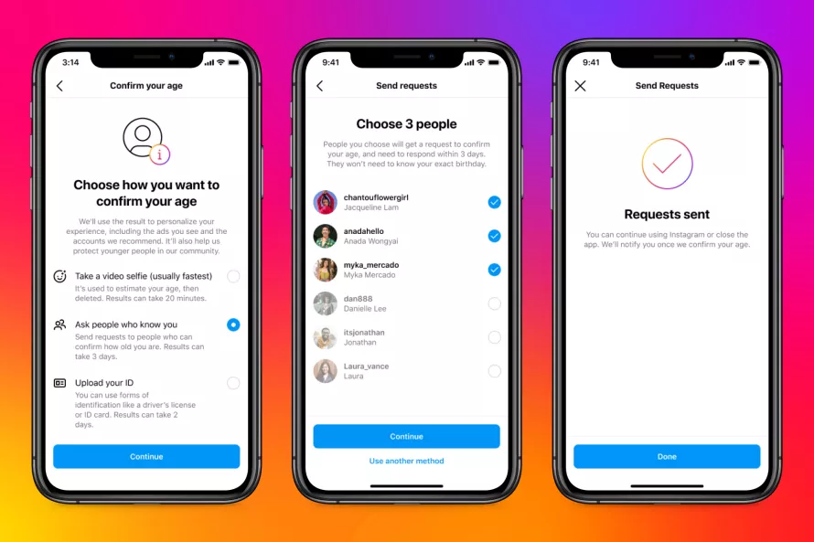
Although announced last year, I only heard of Instagram’s new age verification tests this morning. In order to verify that you are above 18, Instagram will require users to choose one of the three methods of verification: a government-issued ID, a video selfie that an AI tool can then review, or a social vouching system where three of your followers can confirm you are over 18.

Social Vouching: This option allows you to ask mutual followers to confirm how old you are. The person vouching must be at least 18 years old, must not be vouching for anyone else at that time and will need to meet other safeguards we have in place. The three people you select to vouch for you will receive a request to confirm your age and will need to respond within three days.

The social vouching system to me is the most interesting, especially since I have been noodling over the idea of decentralized identity and verifications for a while. The system closely resembles the idea of Solidarity Lending which I first heard about when I read about Mohammad Yunus‘s Nobel Prize-winning work with the Grameen Bank.

Apple also has a social vouching system in place if you forget your apple id.

Web3 applications take this a step further with “M-of-N” (multisig) transactions where the “N” is the pre-defined community of individuals that collectively decide on how transactions should be carried out.

Multisig transactions are also referred to as M-of-N transactions, with M being the required number of signatures or keys and N being the total number of signatures or keys involved in the transaction.

The idea of a collective making confirming a claim is a core principle of decentralized systems and it is encouraging to see it starting to emerge in mainstream applications. Could we ever make a sign-up/sign-in system based on collective claims as mainstream and the cryptic oAuth flows we have today with singular entities verifying claims? Here’s hoping 🤞 !

Digital Personas


Screen Shot 2015-12-06 at 9.12.28 PM.png
Definition on Merriam Webster

I have been thinking quite a bit about the way we interact with technology lately. While underlying technologies get more capabile everyday, the way we interact still feels like its not evolved as much since the early days of computing. Even more so now, with the rise of natural language as an input mechanism, a robotic answer from the device or application often feels …lacking.

Almost everyone I know with an iPhone has asked Siri way too many goofy questions and are delighted when it can answer even a few of them. I have to keep myself from thanking my Amazon Echo everytime it answers a question for me. Could devices in the future not only anwer us academically but also with a hint of personality that doesn’t make interacting with them feel so robotic?

Probably the first piece of anthromorphized software I remember


Siri’s personality gives her a distinct character compared to the competition


Below are a few interesting examples I have seen in the last few months that I wish would influence more thinking in User Interfaces. By giving the software experience a personality, they feel a lot friendlier and definitely more fun to use.

Jibo

Jibo’s pitch calls it a “the first social robot for your home”. The project first appeared as an indigogo campaign and raised close to $4million. At $750 per device, I am not sure how widespread its adoption will be, but the very pixar-inspired interactions make it a lot more appealing.


LG’s AKA phones

LG’s AKA is an interesting take on smart phones. LG’s official site claims its the first smart phone with persona.

Screen Shot 2015-12-06 at 11.13.21 PM.png

Each phone comes embedded with a personality (1 of 4) that is mostly manifested in the shape and behavior of the eyes on top of the phone display. The included case covers only 3/4ths of the screen leaving the top quarter always available to display the eyes. The eyes behave differently when you shake the phone, turn on the music, have notifications or when the phone is running low on power. It also comes with a plastic figurine that has some Augmented Reality based interaction when used with the phone’s camera.

Carrot Fit

While there are a number of apps out there that read your HealthKit / Google Fit data and render them in a variety of visualizations to communicate your fitness metrics, Carrotfit is amusing because it personofies a pretty nasty fitness coach who throws mean insults at a way to motivate you to do well. Not a technique that I would recommend in real life of course, but its definitely amusing coming from an app.

TEP

Tep is another interesting app very reminiscent of tamagotchis from back in the day. The apps lets you raise a digital pet whose health is based on your exercise levels. The anthromorphication of exercise data is interesting and may let users connect to it more than just a numerical value.

These are a few examples that keep going back to when thinking about Digital Personas.  If you have any others, please share them below.

Links:

Building an Intelligent Bot using the Slack API


UI Concept: Using Android’s Soft Keys for Screen Pinning

I have written before on how Android could be using their software navigation buttons more appropriately. Seeing how Android 5.0 and 5.1 handle screen pinning seems another one of those situations where it could leverage that capability.

For those unaware of the feature, Android 5.0 introduced a feature that allowed you to pin a certain application to the home screen. The primary use case for this feature is to prevent a child or some one you hand over your phone to to accidentally exit an app that you want them to see/use. Since the feature doesn’t require a pin number to exit the app, the feature is not so much designed for security but rather for preventing accidents. Exiting the pinned app requires you to tap the “Back” and the “Overview” screen at the same time. A feature that people may forget (though the OS does bring up a message if you do tap any of the navigation buttons when a screen is pinned). This is probably what prompted a more explicit how-to view explaining the exit action in Android 5.1.

However this feature once again doesn’t take into account the Android soft keys. When a screen is pinned, why not change the graphics for Back and Overview to pin icons. This would also reinforce the fact that the phone is in a separate “pinned screen” mode.

screen-pin

As always, thoughts are welcome 🙂

Improving Android’s NavigationBar

One of the interesting features that were released as part of Android 3.0 HoneyComb release back in 2011 was the introduction to the soft navigation buttons. To me, the system seemed full of potential as navigation buttons adapted to better educate the user as the user used the system. For example, while using an application, if the user ended up launching the keyboard, the back button would change to indicate that back would now just dismiss the keyboard and not actually go back to the previous screen.

keyboard


Three years later, I am surprised that not much else was added. The back navigation while powerful still can get ambiguous at times. Below are a couple of ideas I think can really improve the user experience on Android today.

Preventing accidental over-backing

Accidentally hitting back one too many times is a problem that I encounter enough times that it really does get irritating. I am sure it happens to other app developers as well, which is why often you see developers implementing the extremely frowned upon “Are you sure you want to exit” modal alert in apps.

The soft button could really fix this problem by changing itself to indicate that you are at the last item in a stack. I am not an icon designer but here is how I imagine the soft keys changing when the user is on the only activity in the stack. The icon clarifies that hitting that button will exit the activity.

app-close


Enabling Done Discard Pattern

The constant presence of a back button causes confusion in one other place: when a user is modifying data, like adding a todo item on a list or adding a new contact. Without an explicit tap on a save button, hitting back or tapping on the Home icon now adds ambiguity to the question of whether the user wanted to save the data or not. One of the nicer patterns that emerged in Android was the Done/Discard pattern that Roman Nurik released as an Android library a while back, but because it doesn’t prevent the back button, a better way was if Android introduced a “Done Discard Activity” that would modify the back button and maybe temporarily hide the multitasking action.

done-discard


What do you think? How else could the the digital nature of the Android navigation bar be used to improve Android UX?

Android wishlist: A different notification UI for background services

This post is first in a series around enhancements to the mobile experience I’d like to see going forward. Stay tuned for more 🙂

Background services are one of my favorite features on Android. As the idea of a smartphone changes from a phone to a true contextual device, background services that keep track of user context and push information to the user at appropriate times are essential. That said, the current visual treatment they get on the device to let a user know that they are running, which hasn’t changed much since the inception of Android, needs to change.

The Problem

Here is a screenshot of my notification shade right now. Note that only one of the 8 notifications I am currently seeing is actually a new event that I actually need to respond to. The flooding of my notification window with the always running service notifications numbs me to actually important actionable notification that sits there.

2014-05-10 12.59.31


Proposed Solution Option 1:  Notification Tabs with services tucked away

A lot of ROMs already implement Notification Tabs. Moving the background services to a separate tab so that I don’t have to look at them whenever I pull down the shade would solve the problem, though it does add some complexity to the shade.

2014-05-10 12.45.32


Proposed Solution Option 2: Collapse background service notifications into one low-priority notification:

This option may be a little better since you don’t add the cognitive complexity to the notifications shade. Simple is better usually 🙂

2014-05-10 13.35.20

Final thoughts:

In both the cases above developers will have to explicitly change their own notification priority to escape the “grouping”. So if a significant event occurs, their notification can be shown along with the rest of the notifications.

As notifications become increasingly more important to the mobile experience, like the coming smart watches that are all about contextual notifications sent by your phone, there is a greater need to make sure that we don’t overwhelm the user with an unorganized stream of information.

As always, feedback is most welcome 🙂


Location Check-Ins are the new Photos

Off late I have started using quite a few location based services like Foursquare, Foodspotting etc, and everyday more interesting apps crop up. However the current model for location based apps requires me to check into each app individually. The problem is when I am at someplace interesting enough to check in to, I am usually with people and I can only take so much time peering into my phone before coming across as rude to the rest of the group.

Compare this with how I interact with photos today. I take a pic and then can choose among any number of apps on your device that can do interesting things with it. Even better, I can manipulate the photos after the event I was taking the picture at.

I feel the whole model of checking-into a location has matured to a point where it can graduate from the app level to the platform level. I would much rather bring up some native location app and check-in to my phone. The check-in is an actual object, like pictures or music and it is now owned by me. It contains the location information as well as the time. Once checked in, I can “share” my checkin to any apps that can do something with it. So I can forward my checkin to Foursquare to inform all my friends I am there, to FoodSpotting to discover whats good to eat there and to any other app that may need that info.

This model has a number of advantages to it:

  • I am building up a location history that is no longer trapped inside one app or service.
  • I can choose to share my checkin with apps later (for example if my only motivation was to get some virtual points for being there, I can check into that service the next day)
  • I can checkin to multiple services in poor connectivity locations by only needing to pull in map images etc once.


Of course there are certain challenges here:

  • Some services like Foursquare may want to know immediately when you have checked in to present local offers etc. This could be done by the platform sending a system level event that these apps can listen to when a user checks in to a location.
  • Different services have different location data, for example Foursquare has a lot of geo data but Foodspotting may have better data on restaurants so there will be the need for some standard model of annotating the location with other meta information while the user is locating himself on the map. For example, the map the user is presumably zooming in to can show pins from different services with different icons.


Hopefully platforms like Android and iOS add this capability as a core part of the OS pretty much like we use maps today. Till then, the idea of using more than one or two location services at any point is pretty difficult.

On Better Printers

After another fairly annoying morning with my printer, I was reminded of this satirical post that the Onion ran on Tim Cook and Printers. The premise of this was basically that printers were as dull as a topic anyone could think of (basically emphasizing the difference between the creative Steve Jobs and the very operationally centric Tim Cook)

New Apple CEO Tim Cook: ‘I’m Thinking Printers’

SAN FRANCISCO-Following the resignation of Apple founder Steve Jobs, incoming CEO Tim Cook called a meeting of shareholders and members of the press Thursday morning to announce that he envisioned printers as the company’s future. “Laser, ink-jet, double-sided, color, black-and-white-the future of technology is in printers.
img

And yet I really do think printers need their “ipod” moment. We have for far too long been stuck with a purely utilitarian implementation that is a cause of frustration more often than not. Anyone remember this sketch by Eddie Izzard?

So I really like this printer concept that I saw last week. This may of course be overkill, but I can’t wait till I have a printer that actually is joyous to use.

Of course I feel the days of the printer may be numbered. I hardly ever use mine except to occasionally print boarding passes for the few airlines that dont yet generate emails with those as QR codes, but still if I do have to have one, I want one of those 🙂

Update:

Meanwhile there are folks at Bergcloud who are completely reimagining printers more as a toy.

Hello Little Printer, available 2012 from BERG on Vimeo.

Notes on Game Mechanics

The recent explosion of “game based” apps out has led me to read quite a bit about the topic. Here are some notes on books, articles and presentations I have been reading:

Some Rules for Game-Based Systems (from the book Game Based Marketing):

  • Favor long term loyalty not short term competitions
  • Dont offer direct prizes, offer virtual points. Real world value of virtual points can be tweaked at the time of redemption.
  • Virtual points can also be used for virtual goods. Virtual Goods Economy is 5.5 Billion Dollars
  • Does redemption matter? Huge number of points are almost never redeemed
  • Top 5% of airline customers generate 40% of the revenue
  • Create opportunities for elite members to show their eliteness (like lounges in Airports open only to elite members)
  • Create artificial scarcity and rewards around it.
  • First reward should be soon
  • Casino style *random* rewards create short cycle reinforcement
  • Need both long term goals (level ups) and short term (mini games/challenges)
  • All game based systems need:
    • Large community
    • Point System
    • Simple Communication platform

Types of Players (from the book Game Based Marketing):

Four Player types based on motivation:
Achievers
Go to great lengths to get rewards
Dont care for winning in a vacuum: need an audience (leaderboards)
Need the Socializer
Socializer:
Want to build meaningful interactions
Often are more about helping others win rather than winning themselves
Explorers:
Need rich virtual worlds to explore
Love to share detailed accounts of their explorations
Long games with repeated actions bore them
Killers:
Need simulated win & lose conditions
** The Naive Player **
Fairly unaware
Need to be made aware that a game is going on
  • Achievers
    • Go to great lengths to get rewards
    • Dont care for winning in a vacuum: need an audience (leaderboards)
    • Need the Socializer
  • Socializer:
    • Want to build meaningful interactions
    • Often are more about helping others win rather than winning themselves
  • Explorers:
    • Need rich virtual worlds to explore
    • Love to share detailed accounts of their explorations
    • Long games with repeated actions bore them
  • Killers:
    • Need simulated win & lose conditions
  • The Naive Player
    • Fairly unaware
    • Need to be made aware that a game is going on

A really awesome presentation on the shallow game design that seems to be creeping into web properties by Sebastian Deterding

“Yet when I look at most gamified applications today what they do is use game elements to tie us even more tightly into our worldly toils and schemes. They are glorified report cards that turn games into work rather than life into play, and users into pawns instead of players”

Pawned. Gamification and Its Discontents

The secret to Farmville’s popularity is neither gameplay nor aesthetics. Farmville is popular because in entangles users in a web of social obligations. When users log into Facebook, they are reminded that their neighbors have sent them gifts, posted bonuses on their walls, and helped with each others’ farms. In turn, they are obligated to return the courtesies.

  • Farmville is defined by obligation, routine, and responsibility;
  • Farmville encroaches and depends upon real life, and is never entirely separate from it;
  • Farmville is always certain in outcome, and involves neither chance nor skill;
  • Farmville is a productive activity, in that it adds to the social capital upon which Facebook and Zynga depend for their wealth;
  • Farmville is governed not by rules, but by habits, and simple cause-and-effect;
  • Farmville is not make-believe, in that it requires neither immersion nor suspension of disbelief

Other links:

On User notifications: Alert, Notify, Acknowledge

In any client-side application of reasonable complexity there is a lot going on. There are numerous moments during its lifespan where it might want to communicate to the user of different events: errors, underlying data changes, etc etc. While coding an application, its very convenient to just use the native “Alert” implementation to inform the user of some change in the application state. Every UI framework supports it, and in some cases like the iOS UIKit, it doesn’t look awful almost leading you think it may not be a bad idea.

Unlike people though, all user notifications aren’t made equal. Alerts demand immediate attention (in the case of JavaScript, they stop the entire GUI thread freezing the application, though thats not the case in other UI technologies). Recently I wanted to get rid of the Alert windows I had placed in my rush to get EspressoReader out of the door, and started looking at different notification paradigms out there.

One concept I wanted to borrow from was application logging frameworks like Log4J. Logging frameworks usually define a series of levels that you can use to define the priority of your message, for example in the case of Log4J the levels are:

  1. Debug
  2. Info
  3. Warn
  4. Error
  5. Fatal

While tempting, these dont really map to any order of priority for end user notifications. Looking around the web though,  I did see some interesting ideas around notifications. For example, XUL (Firefox’s UI framework) includes a NotificationBox control:

This system seems to be getting pretty popular now, with the Chrome browser UI framework including something similar to that as well. Gmail notifications are in the same vein:

The thing with GMail notifications is that they are closer to the actual interaction that prompted the notification which works well (Fitt’s law in action!)

I guess this system is slowly becoming standard. I really wish “notify” was a built in function in JavaScript similar to “alert” but at least there is a jQuery plugin that seems to add that functionality now.

Another interesting notification system is the fading message box like discussed here, or more famously, as shown by Growl

However, the problem with such notifications is that they are pretty transient (generally fade out), which is often not what you want. I couldn’t really find an official name for these so I call them “acknowledge boxes”. On the importance scale, these seem to the ones with least importance. Another acknowledge notification is an audio clip played when an action is performed, though those need to be used with caution since they get annoying pretty soon.

So here is my sorted list of prioritized notification UIs:

  1. Alert: Most severe, “deal with me now” kind of messages
  2. Notify: Hey something happened. Finish whatever you are doing and then let me know
  3. Acknowledge: Least important “I heard you” kind of messages

If you have any other interesting notification user interface examples, please share them here.

Mark Zukerberg on Social Applications

Techcrunch has a pretty fantastic interview with Mark Zukerberg, CEO and Co-Founder of Facebook. While the whole interview is definitely worth the read, the following part resonated strongly with me:

One thing that I think is really important that I think is context for this, is that I generally think that most other companies now are undervaluing how important social integration is. Right, so even the companies that are starting to come around to thinking, “oh maybe we should do some social stuff”, I still think a lot of them are only thinking about it on a surface layer, where it’s like “OK, I have my product, maybe I’ll add two or three social features and we’ll check that box”Âť. That’s not what social is. Social – You have to design it in from the ground up.

Off late the “social integration” tier of a lot of the new services tends to be “publish this activity to Twitter or Facebook”, and that gets old really fast. Its why I have updates from services like FourSquare set to be filtered out of my Twitter stream. Thankfully Tweetdeck makes it really easy.