Great talk by Don Norman, a founder of The Cognitive Science Society, and widely considered to be the first to apply advanced human factors to design via cognitive design on The three ways that good design makes you happy:
The three ways he talks about are:
- Visceral: How pleasant things seem to work better.
- Behavioral: How good design lets you feel in control.
- Reflective: How people prefer design that reflects their personality.
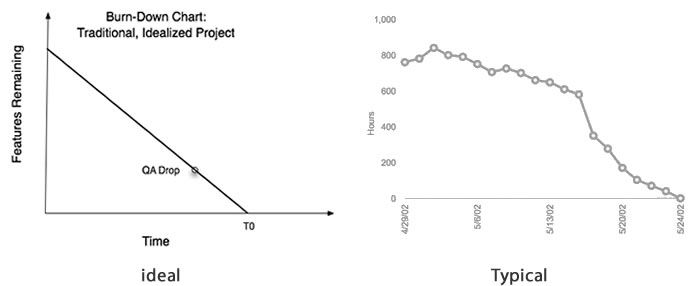
One interesting point he makes is how a happy state of mind is puts the brain in “breadth first search” mode and is more conducive for out of the box thinking, but tension and some pressure puts you in a “depth first search” mode (as dopamine gets added into the system). Moment of self realization here for me personally: as a programmer I have often preferred tighter deadlines (note: not to be confused with unrealistic) to open ended project timelines. I need the pressure to focus. A bunch of my programmer friends say they feel the same way. Thats why the burn down charts for closed work tickets is almost never the ideal one:

(note the change of slope as projects approach end dates = more pressure)
There is often the temptation (by me anyway) to carry the model of deadline driven development to design, but Don Norman’s talk indicates that this would be a bad idea, especially if you are conceptualizing new experiences. How much pressure in terms of deadlines and deliverables can anyone apply on design teams before you kill lateral thinking thats absolutely required for creative teams. However its just as easy to fall into the time sink of finding the perfect experience. Voltaire’s quote about Good being the enemy of Great comes to mind again.
So concept in breadth first mode, execute in depth first.
The concept also seems applicable to application/web design around browse and consume. Browse pages/screens, where there isn’t an end goal really and a user is out looking for “something interesting”, should put people’s brains in breadth first mode, with more emphasis on visuals, etc, but when the user is in content consumption mode, like say on video consumption pages or web search, pages, a muted design may be a better idea. It certainly explains why Google Search pages, which most of us use to get to something we need and not really browse, work so well, but on all their other applications where users are more about entertainment than work, their designs feel awful.
